Scatterplot for text data & Popularity of news articles
14 May 2019
In this post, we will build a scatterplot for text. For this, we’ll collect the data from the publicly available Kurier.at dataset in BigQuery.
We will upload a sample that contains page tracking events of Google Analytics data from Kurier.at (Austrian news site).
The goal of this post is to create a scatterplot for text that is intended to visualize and analyze words frequency in news articles.
This notebook illustrates how to:
- Pull data from Bigquery
- Use a pre-trained statistical models in German with spaCy
- Visualize words frequency vs Popularity of articles
1. Pull data from Bigquery
We will query Kurier.at Google Analytics sample dataset from BigQuery. The query contains 2 columns, the first column shows the title and the second column the number of pagesviews for each article.
%matplotlib inline
import matplotlib.pyplot as plt
import scattertext as st
import re, io
from pprint import pprint
import pandas as pd
import numpy as np
from scipy.stats import rankdata, hmean, norm
import spacy
import os, pkgutil, json, urllib
from urllib.request import urlopen
from IPython.display import IFrame
from IPython.core.display import display, HTML
from scattertext import CorpusFromPandas, produce_scattertext_explorer
project_id = <YOUR PROJECT FROM GCP>

df_bq = pd.io.gbq.read_gbq('''
#standardSQL
SELECT
(SELECT MAX(IF(index=6, value, NULL)) FROM UNNEST(hits.customDimensions)) AS headline,
  SUM(totals.pageviews) AS Pageviews
FROM
  `cloud-training-demos.GA360_test.ga_sessions_sample`,
  UNNEST(hits) AS hits
WHERE
     # only include hits on pages
      hits.type = "PAGE"
      AND
      fullVisitorId IS NOT NULL
      AND
      hits.time != 0
      AND
      hits.time IS NOT NULL
      AND
      (SELECT MAX(IF(index=10, value, NULL)) FROM UNNEST(hits.customDimensions)) IS NOT NULL
GROUP BY
  headline
ORDER BY
  Pageviews DESC
''', project_id=project_id, verbose=False, dialect='standard')
print(df_bq.shape)
2. NLP with spaCy
For this step you have to ensure that spaCy is installed on your notebook and then you load the german language model. spaCy introduces a novel tokenization algorithm, that gives a better balance between performance, ease of definition, and ease of alignment into the original string.
pip install scattertext
python -m spacy download de_core_news_md

import spacy
import de_core_news_md
from spacy.lang.de import German

nlp = de_core_news_md.load()
3. Visualize words frequency with Scattertext & popularity of articles
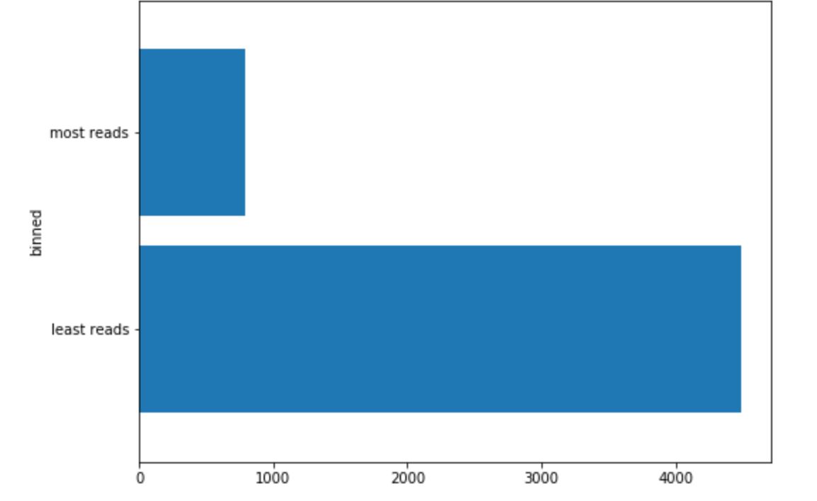
Before we plot our text data, we need to set a threshold for our pageviews to split our data into most and least reads news articles.
threshold = 100

# Copy
data = df_bq.copy()

# Max Pageviews
max = data['pageviews'].max()

# binned
custom_bucket_array= [0, threshold, max]
labels = ['least reads','most reads']

data['binned'] = pd.cut(data['pageviews'], bins=custom_bucket_array, labels=labels)
data['binned'].apply(pd.to_numeric, errors='coerce')

# drop NA
data.dropna(inplace=True)

fig = plt.figure(figsize=(8,6))
data.groupby('binned').headline.count().plot(kind='barh', zorder=2, width=0.85)
plt.show()
data['headline_clean'] = data.headline.apply(lambda text:
                                          " ".join(token.text for token in nlp(text) if not token.is_stop))

# Tokenization with pre-trained model with Spacy
data['parsed'] = data.headline_clean.apply(nlp)

# ScatterText
corpus = st.CorpusFromParsedDocuments(data, category_col='binned', parsed_col='parsed').build()
html = produce_scattertext_explorer(corpus,
                                    category='plus populaires',
                                    not_category_name='moins populaires',
                                    width_in_pixels=1000,
                                    minimum_term_frequency=10,
                                    pmi_filter_thresold=10,
                                    term_ranker=st.OncePerDocFrequencyRanker,
                                    sort_by_dist=False)

# Save file
import os
file_name = 'text_analytics.html'
open(file_name, 'wb').write(html.encode('utf-8'))
IFrame(src=file_name, width = 1300, height=700)
HTML(html)
Scattertext is a tool for finding distinguishing terms in small-to-medium-sized corpora, and presenting them in a interactive scatterplot. Here we can visualize word frequency from our headlines. The words at the top left are the most frequent words, used in the most popular articles. The words at the bottom right are the most used words in the least popular articles.

Conclusion
This tool can be used to create more effective content marketing strategies, inform future content marketing development and help to remove/replace some keywords from headlines.