Scaling Python for Visualizating and Mapping Data
11 Jul 2020
Each day, NYC311 receives thousands of calls related to several hundred types of non-emergency services, including noise complaints, plumbing issues, and illegally parked cars. These calls are received by NYC311 and forwarded to the relevant agencies, such as the Police, Buildings or Transportation. The agency responds to the request, addresses it and the request is then closed.
NYC OpenData has published the data regarding 311 service requests every day from 2010 to present (last update April 22, 2020). The size of our file it’s about 20GB as a raw CSV and contains about 23 million of records. However, this data does not present a full picture of 311 calls or service requests, in part because of operational and system complexities.
Using the NYC 311 Service Call dataset, we will show the frequency of service calls based on location and plot this data on a map to find common problem areas.
Parallelizing the Python Ecosystem with Dask
Dask is a parallel computing library for Python.
When using Pandas, NumPy, or other Python computations, if you run into memory issues, storage limitations, or CPU boundaries on a single machine, Dask can help you scale up on all the cores on a single machine, or scale all the cores and memory across your cluster.
We can summarize the basics of Dask as follows:
- Dask is fully implemented in Python and natively scales NumPy, Pandas, and scikit-learn.
- Dask process data that doesn’t fit into memory by breaking it into blocks and specifying task chains
- Dask parallelize execution of tasks across cores and even nodes of a cluster
- Dask move computation to the data rather than the other way around, to minimize communication overhead
Dask vs. Spark
Nowadays, Spark has become a very popular framework for analyzing large datasets. However, although Spark supports several different languages, its legacy as a Java library can pose a few challenges to users who lack Java expertise. Spark was launched in 2010 as an in-memory alternative to the MapReduce processing engine for Apache Hadoop and is heavily reliant on the Java Virtual Machine (JVM) for its core functionality. Support for Python came along a few release cycles later, with an API called PySpark, but this API simply enables you to interact with a Spark cluster using Python. Any Python code that gets submitted to Spark must pass through the JVM using the Py4J library.
Reasons you might choose Spark:
- You prefer Scala or the SQL language
- You have mostly JVM infrastructure and legacy systems
- You want an established and trusted solution for business
- You are mostly doing business analytics with some lightweight machine learning
- You want an all-in-one solution
Reasons you might choose Dask:
- You prefer Python or native code, or have large legacy code bases that you do not want to entirely rewrite
- Your use case is complex or does not cleanly fit the Spark computing model
- You want a lighter-weight transition from local computing to cluster computing
- You want to interoperate with other technologies and don’t mind installing multiple packages
- Pandas (GIL challenges, multiprocessing and concurrent.futures libraries)
- Scikit-Learn (joblib (using multipleprocesses, hashing trick, partial_fit()))
In this post, we’ll look at running Dask locally with the distributed task scheduler but we could also run Dask clustered in the cloud using the same distributed task scheduler with Docker.
# Dask distributed scheduler can either be setup on a cluster
# or run locally on a personal machine. Despite having the name “distributed”.
from dask.distributed import Client

client = Client()

client.cluster
So, doing things locally is just involves creating a Client object, which lets you interact with the “cluster” (local threads or processes on your machine).
import os
import geoviews
import seaborn as sns
from matplotlib import pyplot as plt
import holoviews as hv

import dask.dataframe as dd
import dask.diagnostics as diag
from dask.diagnostics import ProgressBar, diag

import datashader as ds
import datashader.transfer_functions
from datashader.utils import lnglat_to_meters
import holoviews.operation.datashader as hd
from bokeh.io import output_notebook
from bokeh.resources import CDN
from datashader.utils import lnglat_to_meters
from holoviews.operation.datashader import datashade, shade, dynspread, rasterize
from holoviews.streams import RangeXY
from datashader.colors import Hot


import warnings
warnings.simplefilter('ignore')

os.chdir('/Users/<YOUR_PATH>')

data = dd.read_csv('311_Service_Requests_from_2010_to_Present.csv',usecols=['Latitude','Longitude', 'Complaint Type'])

with diag.ProgressBar(), diag.Profiler() as prof, diag.ResourceProfiler(0.5) as rprof:
    print('Number of rows: {}'.format(data.shape[0].compute()))
    print('Number of columns: {}'.format(len(data.columns)))
# Performance
output_notebook(CDN, hide_banner=True)
diag.visualize([prof, rprof]);
Visualizing Location Data with Datashader
Datashader is a relatively new library in the Python Open Data Science Stack that was created to produce meaningful visualizations of very large datasets. Datashader’s plotting methods accept Dask objects directly and can take full advantage of distributed computing.
The steps involved in datashading are :
- Create a Canvas object with the shape of the eventual plot
- Aggregating all points into that set of bins, incrementally counting them
- Mapping the resulting counts into a visible color from a specified range to make an image
from holoviews.operation.datashader import datashade, shade, dynspread, rasterize
from holoviews import opts

# Filtering
filtered_data = data[(data['Complaint Type'] == 'Noise - Residential') | (data['Complaint Type'] == 'HEAT/HOT WATER') | (data['Complaint Type'] == 'Street Condition')]
filtered_data.persist()

# Visualization
hv.extension('bokeh')

points = hv.Points(filtered_data, ['Longitude', 'Latitude'])
dynamic_hover = (datashade(points, width=700, height=700, cmap='grey') *
                 rasterize(points, width=10, height=10, streams=[RangeXY]).apply(hv.QuadMesh))
dynamic_hover.opts(
    opts.QuadMesh(tools=['hover'], alpha=0, hover_alpha=0.2),
    opts.Image(tools=['hover']),
    opts(bgcolor='white', xaxis=None, yaxis=None, width=600, height=600))
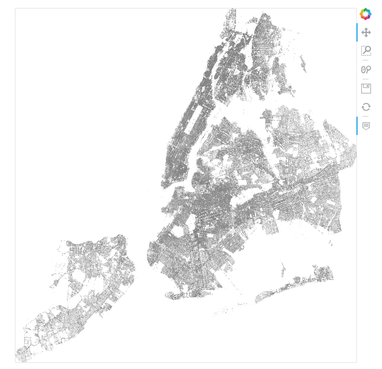
We plotted about 4 million datapoints in a matter of a few seconds.
Now, we will overlay our original visualization on top of a map, so we can tell which parts of the city we’re looking at. However, most mapping services don’t index map tiles by latitude/longitude coordinates, they use a different coordinate system called Web Mercator. So, in order to produce the correct images, we will convert our latitude/longitude coordinates into Web Mercator coordinates.
We will also convert the data from CSV to Parquet format to minimize processing time with Datashader.
# # Converting longitude/latitude to Web Mercator formats
with ProgressBar():
    web_mercator_x, web_mercator_y = lnglat_to_meters(filtered_data['Longitude'], filtered_data['Latitude'])

    # Missing values
    projected_coordinates = dd.concat([web_mercator_x, web_mercator_y, filtered_data['Complaint Type']], axis=1).dropna()

    transformed = projected_coordinates.rename(columns={'Longitude':'x', 'Latitude': 'y'})
    dd.to_parquet(path='filtered_data_webmercator_coords', df=transformed, compression="GZIP")
# Loading data
geo_data = dd.read_parquet('nyc311_webmercator_coords')

hv.extension('bokeh')
plot_options = dict(width=700, height=700, show_grid=False)
api_url = "http://server.arcgisonline.com/ArcGIS/rest/services/World_Imagery/MapServer/tile/{Z}/{Y}/{X}.png"

geomap = geoviews.WMTS(api_url).opts(style=dict(alpha=0.8), plot=plot_options)
points =  hv.Points(geo_data, ['x', 'y'])
complaint_type = dynspread(datashade(points, color_key=colors, element_type=geoviews.Image, aggregator=ds.count_cat('Complaint Type')))

geomap * complaint_type
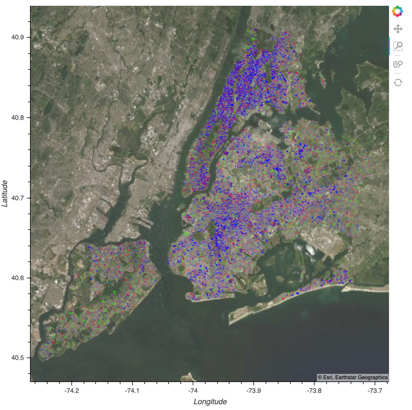
You can see that as we zoom in, the image updates along with the map tiles. It should take less than one second to re-render the image at the new zoom level. You can also see that relative to the area we’ve zoomed in on, there are some areas where more service calls happen than in other areas.